DESIGN OF THE TIMES
When the Snorkel was introduced with great fanfare and massive advertising in 1952, the ballpoint pen was already
beginning to make its presence felt in more substantial ways, even though the introduction of the classic Parker
Jotter was still a couple of years off. Whether it was because people were becoming less tolerant of the traditional
filling methods for pens (and their potential for messiness), or for other reasons, the "clean filling"
feature of the Snorkel had a definite impact on other penmakers. Many were also working on their own "clean
filling" pens. For example, I have read contentions that the introduction of the Parker 61 in 1956 was the
result of an effort to develop a "clean filling" pen that could rival the Snorkel. I am not sure of this,
seeing as an article in the Pennant (Vol. IX, No. 3-4) indicates that capillary-related patents were issued to
Parker in 1950, predating the Snorkels introduction. Similarly, the Waterman "X" capillary-filling pen
of the 1950s is said by Fischler and Schneider to be a reaction to the 61 rather than to the Snorkel. However,
a Pen World article (Vol. 9, #3) describes the efforts of Eversharp to develop their own snorkel-filling pen, a
stillborn endeavor that never made it to market given Eversharps declining fortunes in the 1950s.
The advertising that accompanied the introduction and continued marketing of the Snorkels was extensive, even
purportedly including commercials made by the cast of "I Love Lucy" on that show, and with stars such
as Jackie Gleason appearing in Sheaffers advertising. However, the most intriguing adverts are the early ones,
which explain the "no dunk" filling system by analogy: for example, comparing the Snorkel tube to a hummingbirds
beak sipping nectar, or better yet, slogans such as "Like sippin soda thru a straw!" In this sense,
the term "Snorkel" itself is a slight misnomersince the purpose of a snorkel as used in aquatics is
for a submerged vessel (or person) to draw air from above the surface. Here, the soda straw analogy is much more
correctbut is much more difficult to build a tradename around!
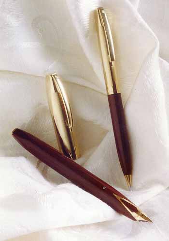
Aesthetically, I consider the Snorkel pens as the final stage in the evolution of the original tapered Balance
pen, updated for the 50s. One only need look at the parade of Sheaffer designs through the 30s and 40s to see this
(the Sheaffer chapter in Lambrous book "Fountain Pens of the World" is a particularly good source to
illustrate what I mean). Of the same girth as the Thin Model (or TM) Touchdown pens introduced a couple of years
before, but lengthened slightly to accommodate the internals of the newer filling system, the Snorkels are admittedly
slim for todays tastes. But this impression is somewhat offset by their length, especially when writing with posted
cap. In this sense, they feel more "balanced" to this writers hand than the shorter TM Touchdowns, and
are comfortable to use for extended periods, aided by the tactile feedback from their finely ribbed textured sections.
|
But even as the 50s went on, Sheaffer must have felt the versatility of the Snorkel filling system was such
that it could be adapted to other designsand so it was, in 1959 for the famous "Pen for Men" (PFM).
As 1960 drew near, the TM model Snorkels and their "balanced" origins gave way to an entirely new design
aesthetic for Sheaffer, exemplified by their now famous inlaid nib that also carried on in the Imperials and Targas
(as well as todays Legacy, though sans Snorkel filler). The PFMs, while not a focus of this article, are repaired
in a manner quite similar to that of the TM Snorkels.
MATERIALS, COLORS, STYLES
Along with contemporary pens from competing manufacturers, Snorkels were also made from thermoformed plastics,
which, although producible only in solid colors, could at least boast a fairly wide range of possible hues. Still,
it must be said that some of the more desirable colors today are partly so because of their relative rarity. For
me, the Snorkel colors seem to fit in with the overall pastel "feel" of 1950s America much better than
the somewhat darker colors from competing lines such as the Parker 51, an impression that is perhaps reinforced
by the Snorkels slimness. [However, since this writer was only toddling his way through the end of the 50s, the
reader can take this impression for what its worth!]
|
 |
With their introduction, the TM Snorkels gave Sheaffer an opportunity to change the plastics they used in making
their pens, switching away from the softer Fortical of the Touchdowns to a somewhat harder formulation. Although
I have never been able to confirm the composition, Snorkel plastic appears to behave similarly to polystyrene in
the way it reacts to adhesives and solvents, and in the way it reacts to stress. (The pens introduction did in
fact roughly coincide with the emergence of high impact polystyrenes from the plastics industry in the early 1950s)
As such, Snorkel plastic can be damaged by abrasion and is slightly brittle, which makes cracking a common form
of failure. However, this also means the plastic can also be polished to a high sheen, and cracks can even be repaired
and filled to a limited extent.
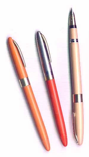 |
Today, the most common Snorkel colors one finds appear to be (in no particular order): black, burgundy, gray, pastel
blue, and pastel green. A more limited number of pens were produced in other colors, and which command a price
premium today. It is not common, but not necessarily rare to find a pastel pink Snorkel, or one in a bright red
("Fiesta" red, according to Sheaffer color coding of the day), or an orange color that is sometimes called
"Salmon". Variations are also seen of the blue and green pastel colors, sometimes referred to by terms
such as Olive Green, Sage Green, and Perrywinkle Blue. Some of the late 1950s Sheaffer codes give a total of 30(!)
colors and finishes, including a "Buckskin Tan", and a "Mandarin Orange" (but no so-called
Salmon). Even a Golden Glow Yellow! But it isnt clear that all of these were made into TM Snorkels. So while
stories are out there of collectors encountering Snorkels in yellow or white, good photos of such pens seem to
be as rare as the pens themselves. And of course, there were the ever interesting and (today) rare clear demonstrator
models.
With the exception of all metal (such as the GF and solid 14K) models, TM Snorkel barrels were always plastic,
with either matching plastic or metal caps. The latter type of pens are also common and very handsome. These are
perhaps most often seen as the line of Clipper/Sentinel pens, with White Dot and GF clips and bottom bands, respectively
paired with either a Palladium/Silver or two-toned 14k gold Triumph nib. Sovereign models lacked the White Dot
and GF band, had a slightly different pattern stamped on the cap metal, and "Sheaffers" stamped into
the clips. They featured traditional 14k two-toned nibs. Then there were the White Dot Crest pens, with all GF
caps and 14k two-toned Triumph nibs. |
Other models (all with matching plastic caps and barrels) include the White Dot Statesman/Valiant pens, which
mainly differed in the metal used for their Triumph nibs. The Admiral/Saratoga variants had no White Dot and narrower
GF cap bands versus their fancier brethren, as well as the inscribed clips. They also had traditional nibs: single
toned 14k or Palladium/Silver in the case of the Admirals, and two-toned 14k for the Saratogas [note that pens
which are often referred to as Saratogas by present day collectors are in fact Admirals]. Although the non-White
Dot models were priced lower than the Triumph nibbed pens, they should not be overlooked as good writersthe internals
were identical to the more expensive lines, and the traditional nibs (especially those on the Admirals) are often
more flexible and expressive than their more expensive cousins.
Many Snorkels today can still be found with a strange code etched onto the nibs, usually consisting of a letter
and a numeral, such as "M2" or "F5". A few collectors have deduced that the letter denotes
a nib size (such as Medium, Fine, Stub, Accounting etc.), while the number corresponds to a particular nib design
and alloy combination. Other collectors contend that the numbers refer to gradations of size within a nib size
range. This is still a matter of contention, so I will not go into it further here, except to say that no definitive
Sheaffer internal documentation that I know of on this topic has willingly made it into the light of day for further
examination
For additional illustrations of the nib types available on Snorkels, cap photos, and other information, see
various web sites in the Internet and the books of Fischler & Schneider.
NEXT PAGE
